
New maps offer more detail to ocean planners about how animal concentrations change during the year
Ocean, Science Add commentsAn ongoing challenge for ocean regulators has been our relatively coarse understanding of where ocean animals are at any given time. For many species, we’ve been limited to relatively broad-brush data, such as regional population estimates or having a moderately clear idea about particular feeding or breedings areas, with limited knowledge of where these same animals go at other times of year. All this has made the crucial task of estimating the impacts of human activities (Naval sonar and explosives exercises, oil and gas seismic surveys, construction of new shipping ports) somewhere between difficult and impossible—leading to a mountain of EISs, agency determinations, and court filings over the question of how best to protect ocean life from our noisy actions at sea. Confounding matters for all concerned, on the matter of protecting key habitat, the Navy has sometimes prevailed and sometimes lost in recent challenges.
Over the past decade or so, several projects have been bringing data together from a slew of historical studies, along with doing new surveys in the field that flesh out our understanding of animal distributions. These efforts are beginning to bear fruit.
This week, a team from Duke University’s Marine Geospatial Lab released a series of maps and new mapping tools to the public and to other researchers, making available data they’ve been compiling for use in the current round of environmental analysis for the Navy’s east coast and Gulf of Mexico training ranges, and for inclusion in NOAA’s ongoing Cetacean and Sound Mapping project (also known as CetSound).
In addition to an open-access paper published in Nature Scientific Reports, a set of comprehensive species-specific supplemental reports (each one running to over a hundred pages), and a good layman’s overview using the Story Map platform, the Lab also has an online mapping portal, OBIS-SEAMAP, that displays annual animal densities for marine mammals, seabirds, sharks, rays, turtles, and even a few lizards of conservation concern. OBIS-SEAMAP—short for the Ocean Biogeographic Information System: Spatial Ecological Analysis of Megavertebrate Populations—archives hundreds of surveys, satellite telemetry datasets, and photo-ID collections, and has now expanded to include long-term archival of species distribution models.
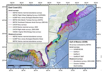 The new Atlantic and Gulf of Mexico models and maps draw on 23 years of aerial and shipboard abundance surveys (left). So far, the quality of survey data, as rated on several factors, has allowed the researchers to create monthly distribution density maps for 11 species and annual maps (showing the full species range and density) for the others. The best place for interested laymen to learn more about the project is the OBIS-SEAMAP page introducing these new models, which has a good lay summary of the work and several introductory maps and animations. If you want to dig into some of the species-specific information, check out the species lists at the bottom of the page; links next to each species open its set of maps right online, with no download necessary, or allow for download of the 100+ page supplemental report and all data and maps for that species. For the 11 species with monthly maps, you’ll also find animations showing the change in species density over time. (For researchers, two other entry points will be of interest: The main OBIS-SEAMAP portal, with its array of informational links, will help orient those preparing to use the data, while a user-customizable global map displays average annual abundance and allows for overlays of environmental factors, and viewing of your choice of species or particular research data sets.)
While the new distribution maps are the most eye-catching product of this work, and the data underlying them should greatly improve our ability to identify areas with high concentrations of one or many species (and hopefully then to limit our activities at some times and/or places to avoid the worst effects), the bulk of the underlying research is a very deep dive into the science of modeling. In addition to looking at a range of underlying oceanic habitat factors (including temperature and plankton densities), the supplemental reports use three different types of models to estimate animal abundance, then dig into clues about why they’re different. And, alongside all the abundance estimates, they calculate the “Coefficient of Variation” of their estimates, which gives an often finely-tuned assessment of statistical confidence, based on how much data is available in each small subsection of the surveyed area. All in all, it’s mightily complex for the layman, but a solid starting point for further study and better estimates in the future.
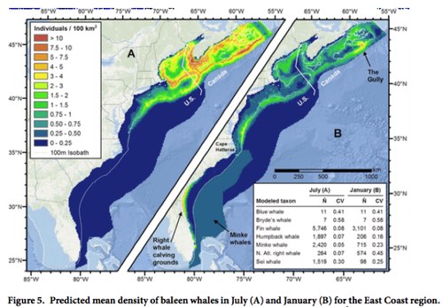
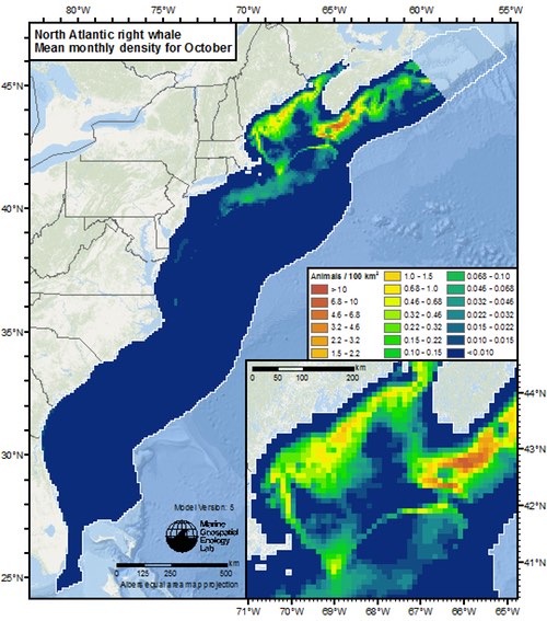
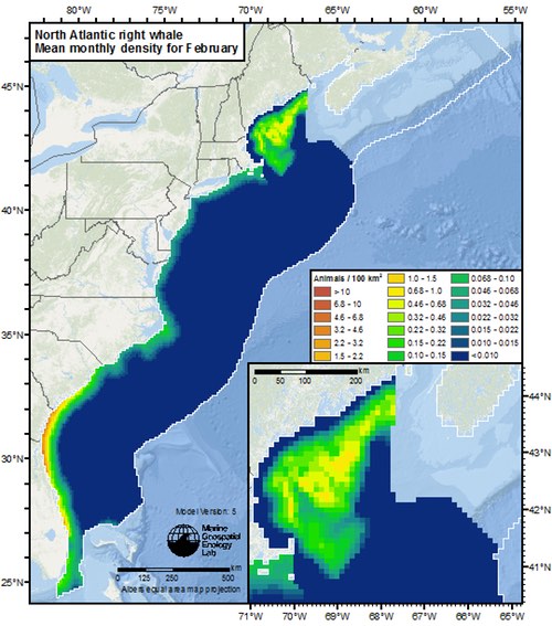
Below is an especially relevant example, showing the seasonal shift in abundance of the North Atlantic right whale, a species of special concern, in that its numbers have dwindled to just a few hundred, making any single mortality important to the species’ long-term survival, and also raising questions about the possible effects of stress, especially in the winter birthing grounds along the southeastern coast. These issues are in the middle of ongoing controversies about proposed offshore oil and gas exploration (UPDATE, 3/15/16: Feds say no to new Atlantic drilling), a new instrumented Naval training range planned for 50 miles offshore, and of course, the perennial tug-of-war over permitting of Naval training activities all along the east coast. Note the abundance estimates; 100 square kilometers is an area roughly 6 miles on a side.
If you want to play with more maps, check out the NOAA CetSound site; the sound side includes sound maps for various US offshore regions and the entire North Atlantic (at different depths and frequencies), while the cetacean abundance side has an interactive map of designated Biologically Important Areas, and data quality ratings for distribution estimates for each month; presumably, the new distribution maps will find their way onto the Cetsound site at some point. Another federal ocean data portal, MarineCadastre.gov, is also compiling maps to help illustrate and inform a range of development and conservation efforts; the new Duke maps will be included there soon as well.